Hello! We're inkle - we made 80 Days, Heaven's Vault and Overboard!. Now we're making A Highland Song. Follow along with our progress right here!
The art of the highlands
—
It's really important to us that our game strongly conveys the unique feeling of the highlands. There's a strong distinction that you feel being in the Scottish mountains compared to say, the European alps or Yosemite National Park. Scottish mountains aren't the highest, the jagged-est or the pointiest. But they have a darkness and weight to them that's only really shared with places like Iceland or perhaps parts of Scandinavia. They can be very lonely too - the further North you go, the further from civilisation you'll find yourself.
Our players don't all need to be fans of the Scottish highlands of course, even if we are! The point is to create a unique and strong aesthetic that's not just "generic green hills and rocks".
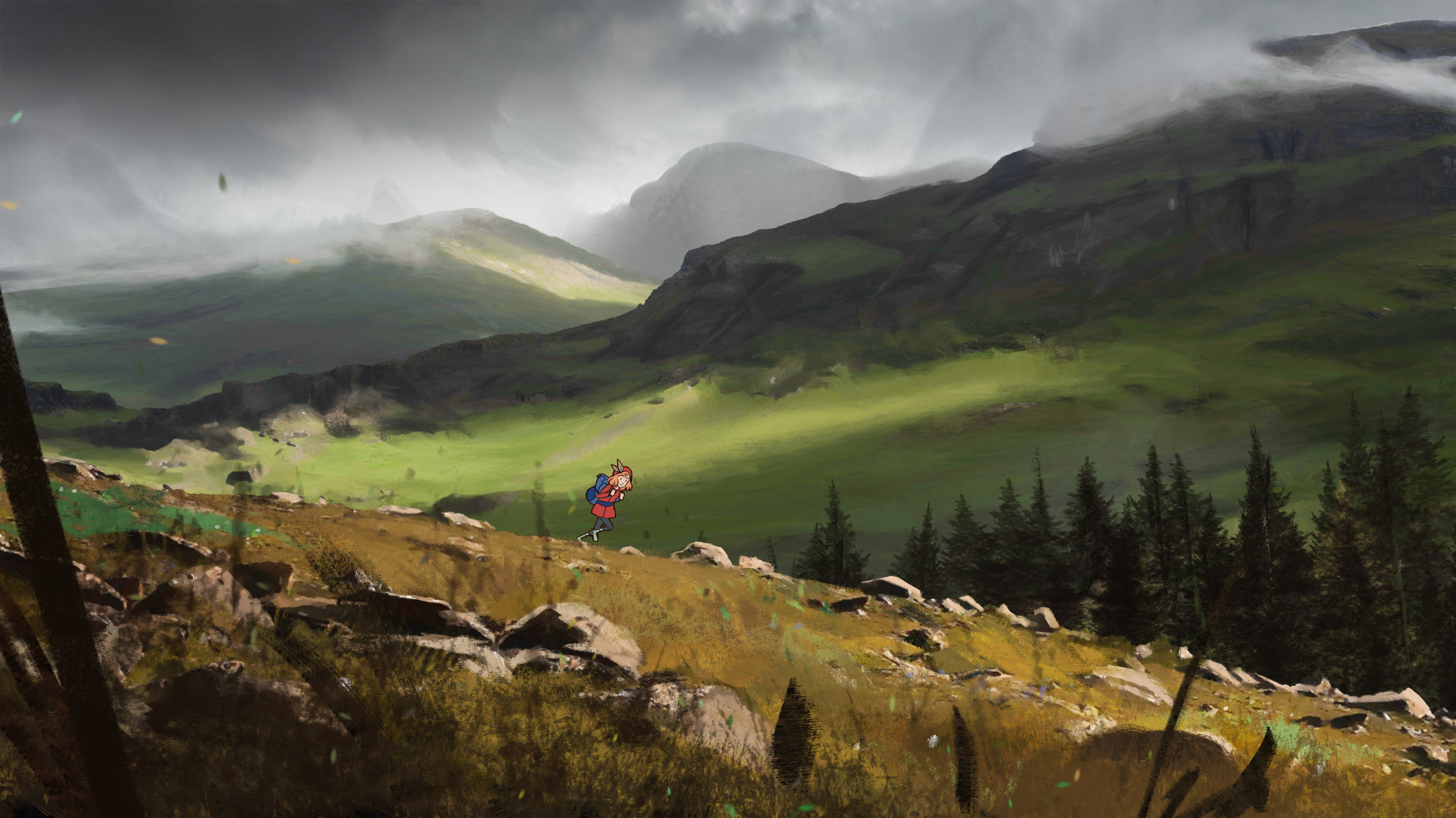
Part of capturing that aesthetic has been about finding an art style that can reflect it with authenticity. We wouldn't want to go with anything too bright or cartoony, so we think a level of stylised realism could do the trick.
The reason we approached Paul first about helping us out with art direction was that his work is both painterly yet has a sense of effortless realism; he's one of those concept artists who can convey a lot with a few important brush strokes.
We think his concept art above is a fantastic example of this! He's also produced an animated version of it that demonstrates parallax, and we'll share that in a future update.
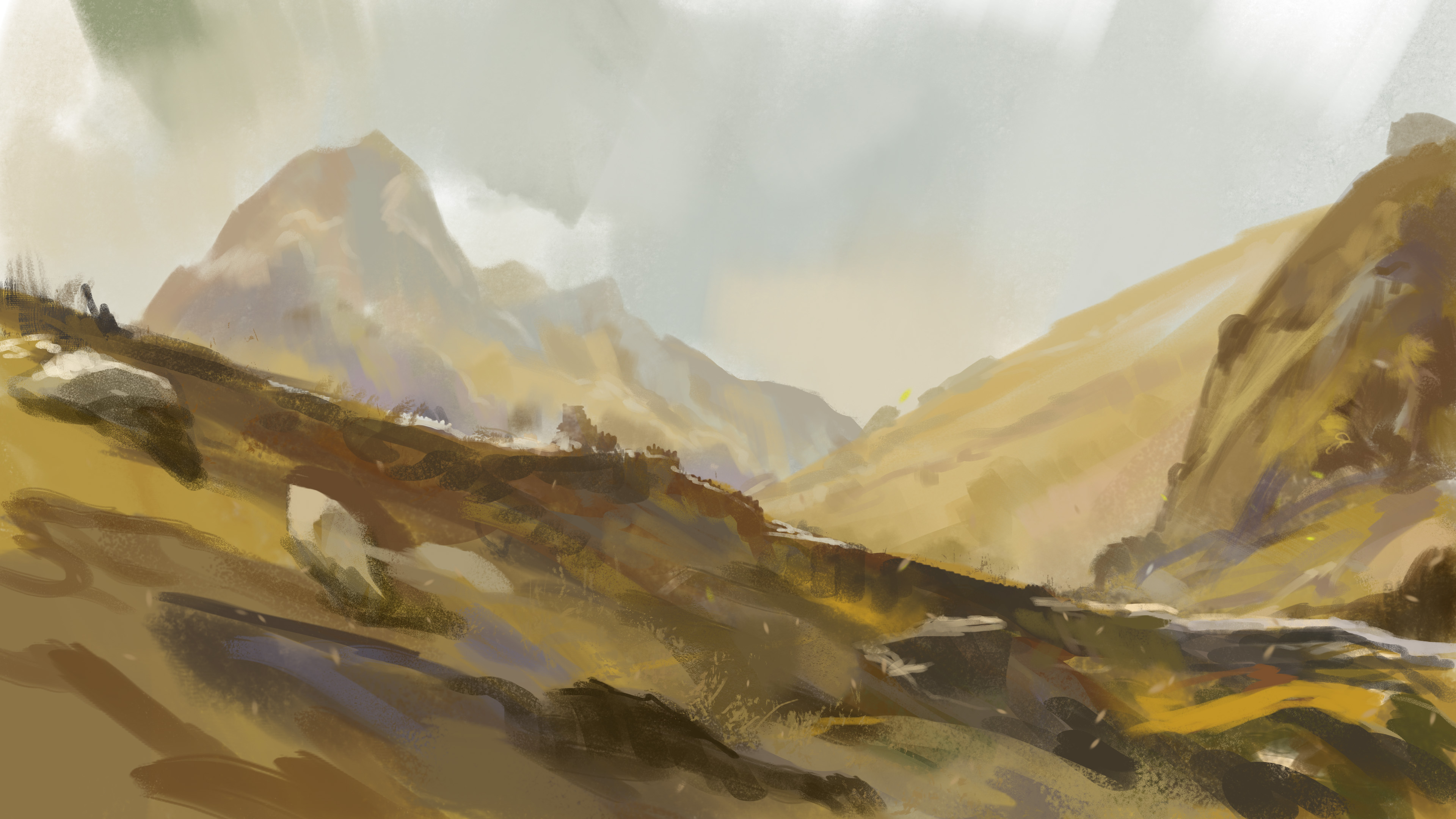
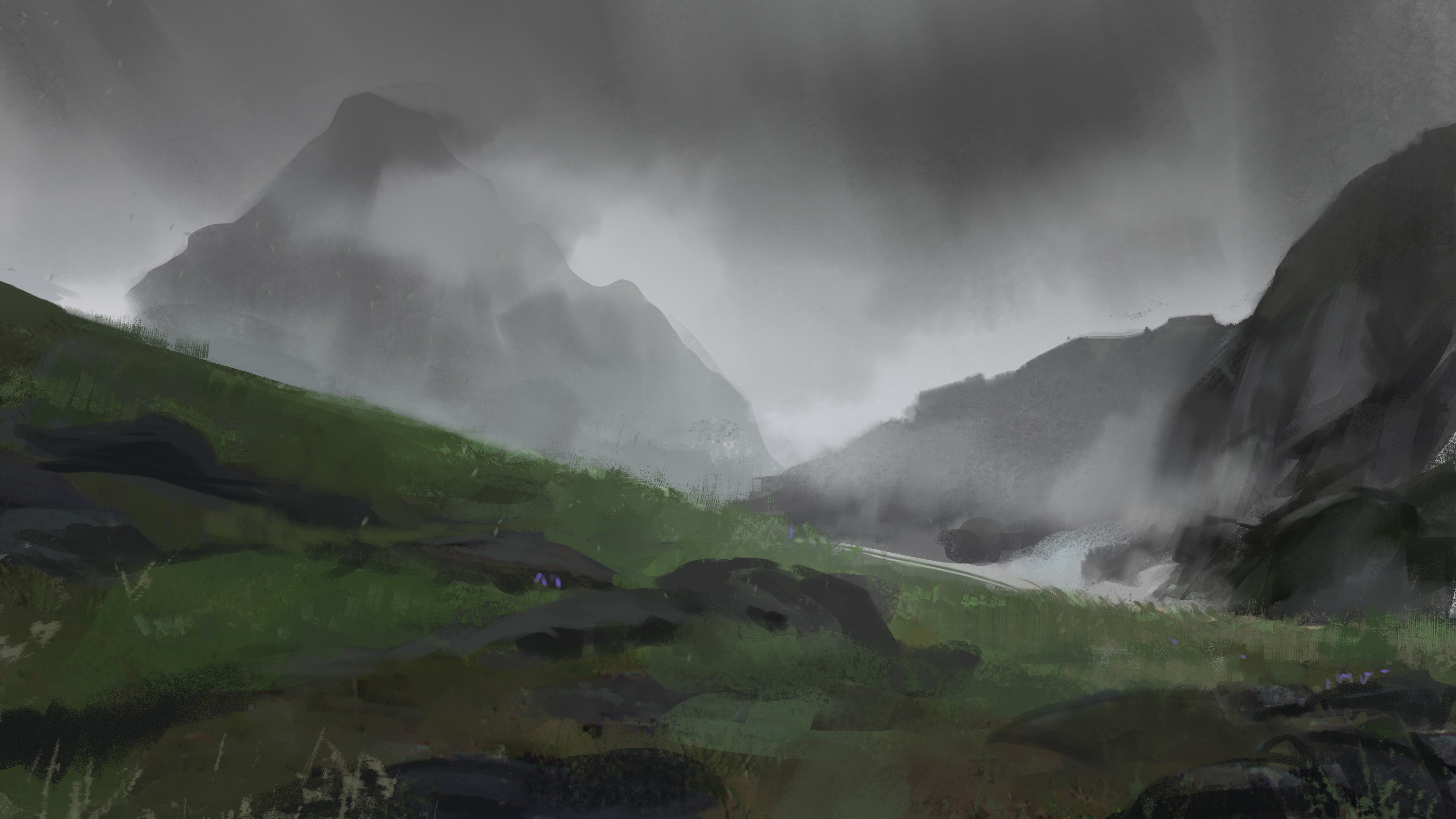
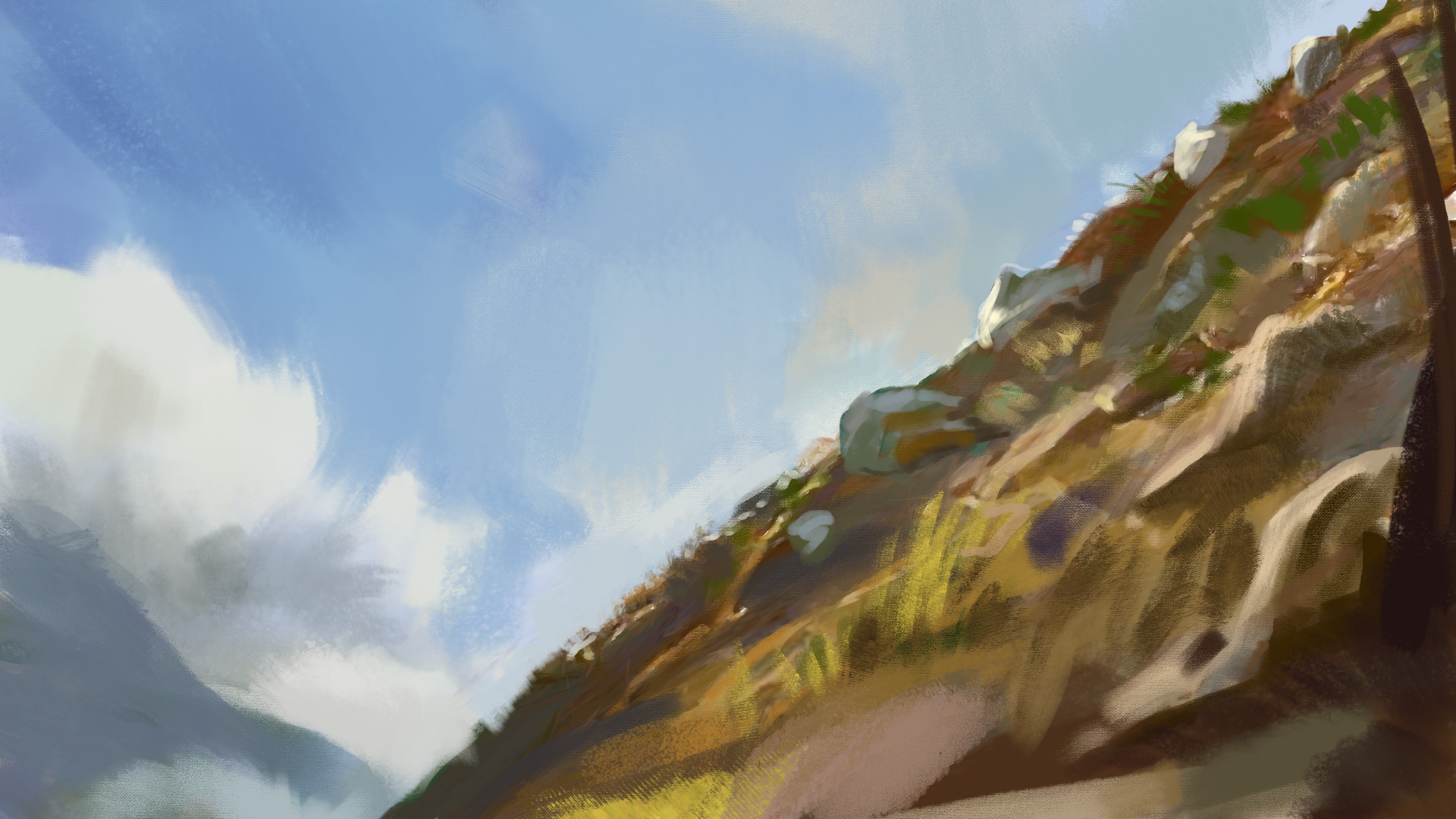
When Paul first joined the team, he started off with a few loose studies to get a sense of the environment: the different times of day, weather and the textures in the foreground. These are a bit looser than our final intended art style, but the looseness is a good demonstration of how much can be achieved with so little!


