Steve Jackson's Sorcery! is here
It's celebration time at inkle: as Part One of the Sorcery! saga is now available for iPad, iPhone and iPod touch from the App Store. The Shamutanti Hills await!
An epic journey
It's been our most complex and challenging project to date, and when we started we didn't really know what we were letting ourselves in for. That we were going to expand on the original we knew, but we didn't realise that would mean adding whole new routes and locations, new puzzles and traps, and writing whole scenes of dialogue to expand on the original. And we definitely didn't know we'd need a 3D engine, a system for mixing sound effects, a server back-end to save your finished game to the cloud, a procedural text generator and, as they say, a fez...
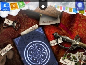
In the six months since we began work, the scope of the game exploded, as we tried things out, developed our ideas, and discovered new elements that just had to make it into the game. But as always, there are a few ideas that didn't make the final cut, so there should be some surprises for Book 2.
But despite everything that's new, we've worked hard to keep to the spirit of the original: it's quirky humour, the emphasis on brains over brawn, and its many tricks, traps and puzzles.
The map
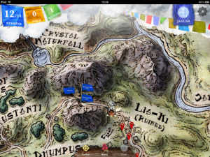
We had some ideas for a map-based interface from the start, to control your path through the story, but it wasn't until we got Mike Schley on board that we realised quite how important that world map was going to be. It's not just the way you choose your route - it's also a living, breathing graph of the story. A lot of people were fascinated by the Frankenstein story-map - in Sorcery!, that map is built right into the app, hinting at the paths and branches you have still to explore.
The 3D relief effect was a big risk: could we get it to work smoothly? Would it slow things down? Would it cope on older devices? Big images ("high-res textures") are one thing that even major consoles are afraid of and here we were, trying to make them run on an iPod. At one point, we even considered turning the 3D effect off on slower models - but with some code magic, and some clever games industry techniques, we've managed to get things both silky smooth, and gloriously pointy.
The art
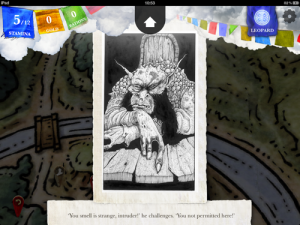
Almost the last feature to make it into the build was the original art by John Blanche. In fact, it wasn't even in the build sent out to reviewers! But we didn't leave it to last because we weren't sure whether to include it: rather, we kept it back because we were absolutely certain that we wanted it in the game - we didn't need to test it out early; it absolutely had to go in, and we're glad it did. The images look great, particularly on super-sharp Retina screens, and we've kept them in the original black and white.
The images for the combat sequences went in a bit earlier, and were a particularly difficult challenge for our character artist, Eddie Sharam. His brief was to produce images of the various monsters attacking and defending, staying true to the original illustrations but bringing these strange characters to life. We weren't sure if it wold work - until we saw the Sightmaster, in all his detail, coming to life (as he beat us up with his staff).

The combat
We could write a whole post just about the development of the combat system, but most of all, we want to hear what people think about it. Moving away from the dice-roll system of the original books was a big decision: we wanted something new, but as with everything else in the app, we didn't want anything too new. The most important thing was that the system played like the old system gave the same kinds of outcomes - but with the player taking decisions, and taking risks, on every turn.
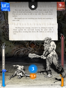
We spent a long time trying out different mechanics, and testing different rules, and the final system is an unusual mix of the Prisoner's Dilemma and Rock, Paper, Scissors. Two opponents each pick how much power they're going to attack with and the highest choice wins. But! A high choice this turn means you'll have less power to play with next turn (and a low choice means you'll get more). And more than that - if you lose the turn, the higher your choice, the more damage you'll suffer. So sometimes, it's worth defending completely - rebuilding your power and taking minimum damage. Other times, it's worth risking an all-out attack, to be sure of overpowering your opponent. But a lot of the time, it's worth trying something in between...
At the same time, we wanted to make sure the combat fed right back into the story, and wasn't just a mini-game. That's what gave us the idea of making a system to procedurally generate combat narrative based on the fight. That was a lot of work to get right, but we're pretty pleased with the results.
Then he is diving forward for your throat! Your own stroke is overpowered. The Assassin's sword is punishingly deep. You move quickly to deflect the blow as best you can with your shield. 'My duty is to sever your head from your neck,' he declares, in a voice as cold as polished marble. 'You will not hold me from it.'
The story, the Spirit, the spells...
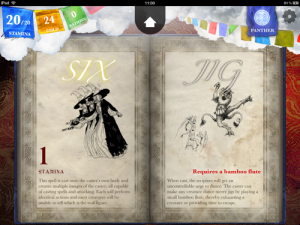
There's lots more crammed into Sorcery! - the text of the story adapting around you, the Spirit Guide which changes to reflect how you play, the Spellbook with its 48 spells, with strange and weird effects as you journey through the world... but this post is long enough and you'll have more fun, discovering for yourself.
So if you're intrigued, please pop along to the App Store: Kakhabad is open for visitors.