Visual design begins for Down Among the Dead Men
Developing a visual metaphor
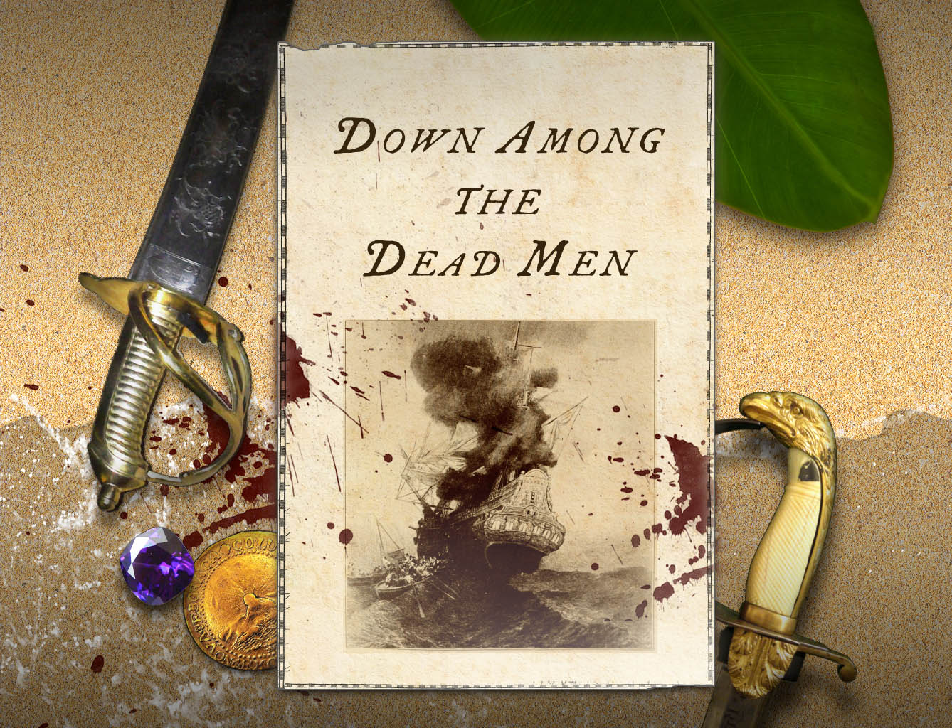
One of the first steps in producing a new inklebook from scratch is to design a visual look and feel for it. As part of this, it's useful to establish a consistent metaphor. For Frankenstein, the metaphor was that you were looking at Victor Frankenstein's desk, full of anatomical illustrations, spilt ink, and his notes and journals. The metaphor doesn't need to be strictly consistent, but keeping it fairly coherent helps make the whole scene glue together nicely. It helps to answer design questions, such as which font to use where, and what to use for graphical flourishes.So, for Down Among the Dead Men, we've started with the scene of being washed up on a tropical beach, along with a set of piratey paraphernalia. We're still developing the exact metaphor - what should the front "cover" look like? Should it be a book cover, a page, or something else entirely?
We're also keen to differentiate the visual style from Frankenstein. While the material aesthetic is inkle's trademark, we want to make Down Among the Dead Men brighter, and communicate more of the gamey elements in the text. For Frankenstein, it was easy to lean on the beauty of the anatomical illustrations. For Down Among the Dead Men, we'll have to find a new touchstone.
We'll post more images as we develop the visual skin further, but see what you think about this initial concept. Also, bear in mind that this is purely a first draft, so the polish and finesse will improve dramatically over the coming days and weeks!
